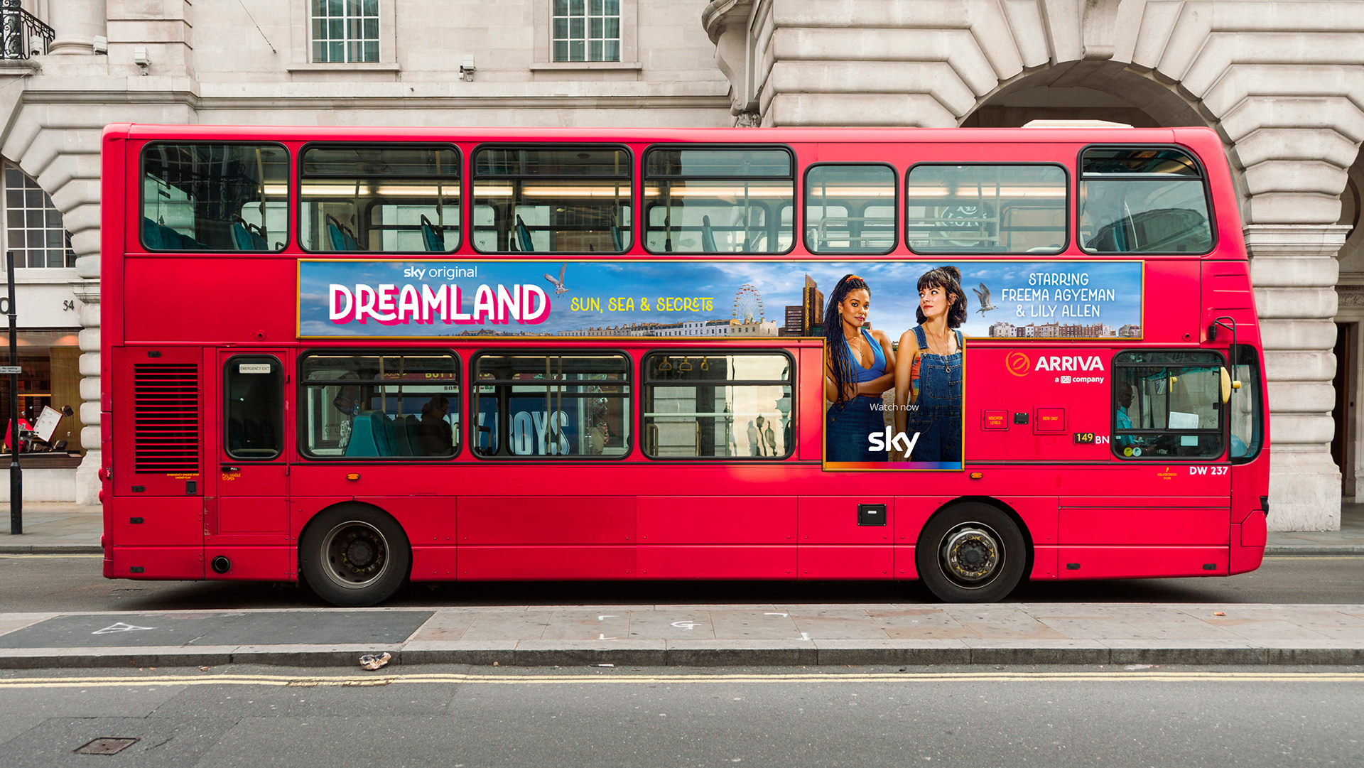
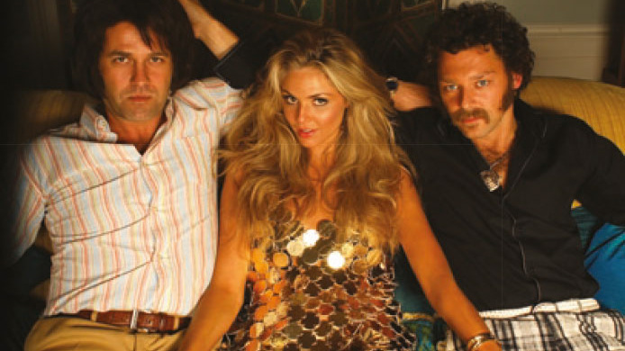
Merman, the producers of this 6-part TV show for Sky, wanted a design for the animated title card of the comedy drama set in Margate. I did some deep dive typographic research in order to suggest dozens of idiosyncratic typefaces that could convey the kitsch of the seaside location, as well as suggest something of the nature of the show's characters.
We ran through numerous options which evoked the retro chintz and charm of a British resort. Narrowed to two candidates which were worked up into animated treatments, eventually the typeface Kindred by Rachel Kick was chosen – an apt choice as its numerous ligature options helped suggest the intertwined nature of the sisters' lives at the heart of the story.
Final animated assets were supplied and colour variants were made in the edit to match the show's colour palette for each episode.


In an interesting twist – or even untwisting – the show's marketing, originated by Sky, chose to unlink the second ligature of L and A. I was informed it was for legibility reasons, but as the campaign also used some of Kindred's even curlier ligatures on the marketing strapline perhaps this rationale is less convincing!